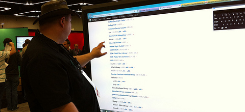
Web design: design for touchscreen or for mouse and keyboard?

Photo by Sebastian Bergmann
Microsoft’s focus on touch input with Windows 8 has sparked many discussions about the differences in design for touch-based user interfaces and those navigated with the mouse. If you’re developing an app or a website, chances are you’re wondering if it’s mainly going to be used on devices with touchscreens, such as smartphones and tablets, or also on desktops and laptops. Many articles can be found online that explain how to design for touchscreen, but none of them explain whether you should. In some cases this decision is easy – if you’re lost, you’re more likely to look at your phone for directions than to take your laptop from your bag – but in other cases it’s not. Will people play your browser game on their tablet or on their notebook? Is your business calendar going to be used in the back of a cab or in the office? Often, it’s hard to predict, and the emergence of hybrid PCs that come with both touchscreens and keyboards adds yet another dimension to this problem.
Continue reading Web design: design for touchscreen or for mouse and keyboard?
