Photo by permanently scatterbrained
There are few things the world hates as much as Comic Sans. Along with Clippy and Windows Vista, this unassuming little font has been the target of resentment, derision and the sort of psychopathic hate usually reserved for serial killers and football referees. But why? What is it about those kid-friendly, rounded little figures that give graphics and typography enthusiasts a rage-boner? We investigated so you don’t have to:
First, Some History…
In 1994, Vincent Connare wasn’t expecting to become an international target for resentment. Stuck elbows deep in a project known as ‘Microsoft Bob’, he was tasked with helping Gates create his most user-friendly interface yet; the sort of package any redneck could use without a subsequent meltdown on the phone to technical support. There was, however, one minor problem: everything was written in Times New Roman, a harsh font Connare couldn’t see connecting with users. Rather than feel like a 19th century schoolmaster was chastising them, he reasoned that his hypothetical redneck would prefer something warmer; a friendly voice that could point him in the right direction, rather than simply hector.
It just so happened that Connare kept a number of graphic novels in his office. Deciding he liked the speech bubble style employed in comics like Watchmen, he tried to emulate it. According to Connare, he was aiming for ‘letters that might have been created by cutting with blunt scissors’; something childish and homely. Ultimately his experiment was rejected for use within MS Bob, but when it came time to launch the mega-successful Microsoft Movie Maker, Comic Sans was chosen to be the program text. By the time Windows 95 came out, the font was selectable in Microsoft Word, and a minor revolution was born.
Something New…
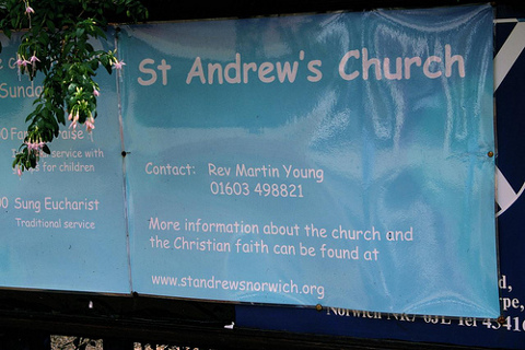
For a certain subset of users, this was it; the moment they’d been waiting for. With the home computer market just beginning to boom, Comic Sans arrived at the exact right moment for Primary School Teachers, bored mums and Village Fete organisers to embrace it as a ‘fun’ kid- friendly alternative to the standard fonts. Unfortunately, it didn’t stop there. Like a particularly virulent bushfire, Comic Sans spread across the English-speaking world with an unstoppable fury. Business documents, warning signs, football shirts and even funeral parlours started using it; seemingly unable to see the discord in a childish scrawl advertising something serious. The utter ubiquity of Comic Sans in inappropriate situations has gotten so bad that bancomicsans.com have amassed a nearly-limitless photo collection.
It’s Everywhere

Photo by Leeky
Arguably, it is this prevalence that creates such unbridled hate. Browsing the MS Word drop down box reveals at least ten other fonts equally objectionable on a purely visual basis, without even touching on any of the ‘webdings’ abominations. Had Comic Sans remained out of reach to excitable users, would it really still be considered the world’s most-hated font? Antonio Roberts for Comic Sans Must Die seems to think not:
(When) Vincent Connare designed the font for Microsoft in 1995, he decscribed it as best being used for “new computer users and families with children”. Despite this it has been constantly misused and can be seen everywhere from school letters, emails from government officials and even in documents about the discovery of the Higgs Boson.
The message that comes out, time and again in similar complaints, is that there’s not anything wrong with the font itself, just in its inappropriate usage. It’s hard to disagree. As Dave and Holly Combs state in their Ban Comic Sans manifesto:
Like the tone of a spoken voice, the characteristics of a typeface convey meaning… Thus when designing a ‘Do Not Enter’ sign, the use of a heavy-stroked, attention commanding font such as Impact is appropriate. Typesetting such a message in Comic Sans would be ludicrous. Though this sort of use if frequent, it is unjustified.
There lies the nub of the problem: Comic Sans’ strange popularity. Like many bad things (Justin Beiber, Michael Bay movies, Twilight) it seems to have no defenders, yet remains bizarrely fashionable. For those who take their typefaces seriously, it’s a headache that may never go away. And what of Vincent Connare, who – Frankenstein-like – unleashed his monstrous creation upon an unsuspecting world? He seems unbothered by the fuss. In a recent interview with the BBC he revealed how easy it makes being a guest a dinner parties. When asked about his job, he simply says he designs type and asks if they’ve ever heard of Comic Sans. According to him:
Everybody says yes.
