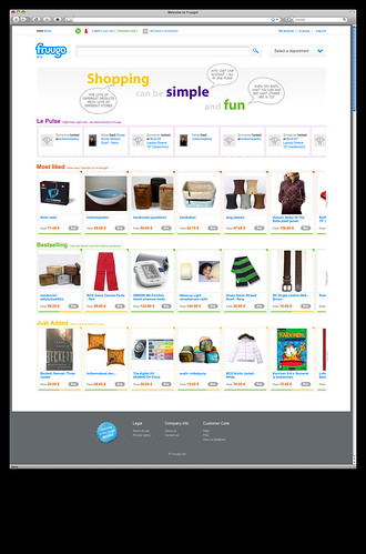
Perhaps it’s just my trained eye, but e-commerce sites are full of mistakes which could have been avoided with a little planning. Sure, having an online store is a real boon for any business given the fact that they are open 24/7, can reach a broad audience and the reduced costs.
Mind you that an e-commerce website involves more than plopping products into a database and adding a shopping cart in the right corner. Here is a top of the most common mistakes (easily correctable) found on the e-commerce websites.
-
Too little information about the products
Online shopping should simulate the real shopping experience. In other words, you will need to compensate for the advantage of picking up a product, touching it, reading the label and looking at it from every possible angle by providing as much info about it as possible. Basically, if you are going to leave your customers wondering about the features of the products, they are very like to take their business elsewhere.
-
Where is the contact information?
Many guides that talks about online scams will point out that any reputable and trustworthy retailer will always include the contact information in a very visible place. Besides being able to trust you, customers also want to know that they can talk to a real person if they need help. Therefore, make sure that you insert the contact information in a location that is easy to spot on every page of the e-commerce site.
-
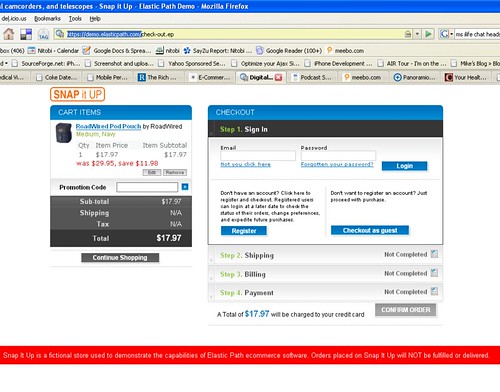
Complicated checkout
The ability to hand over credit card information and complete the order fast and easy is one of the benefits of online shopping. However, it seems that many online retailers forgot that and generally include numerous steps between the aforementioned actions. Think of it this way: the more steps you need before completing the order, the more opportunities you give the customer to change his mind.
-
Asking for an account to order
Having to create an account so you can place an order is not exactly the definition of quick and easy online shopping. In fact, you are just placing another obstacle for customers that are interested in purchasing from you. Not to mention that you will create the impression of being more interested in capturing information and possibly selling it to spammers.
-
Small product images
As mentioned before, the goal of an ecommerce site is to recreate the real shopping experience at a brick and wall outlet. Consequentially, if you are including tiny product images, visitors will be unable to see what the features refer to and hence, you cannot truly convince them that the product fits their needs and preferences.
-
Poorly designed shopping cart
Even though many underestimate its power, the shopping cart plays one of the most crucial roles on ecommerce sites. The shopping cart has the function of allowing customers to add multiple items, revise the quantities, see the price per item, total cost, etc. and this is how you should keep it.
-
Limited payment options
You would be surprised by the number of ecommerce sites that only accept Visa, MasterCard or PayPal. But what if a buyer does not have a PayPal account or owns an AmEx and he is interested in acquiring your products, as it often happens on many sites? That’s right, he will simply take his business elsewhere.
-
The absence of related products
If you were to walk into a standard brick and mortar store, then you will see the products are arranged on special isles with numerous similar or related items. This approach does not only make it easier for the customer to find the products he is interested in, but in online shopping will also increase the add-on sales for your business.
-
No info regarding the shipping rates
Since people want to complete an order rapidly, you have no good reason of leaving the shipping rates information out. Even if they are high, users are more likely to abandon an order if they have to wait until you send them an email with these rates before confirming.
-
Not focusing on the products
Because the primary goal of an ecommerce site is to sell products, you need to make sure that they are displayed first and everything else second. Your fancy, state-of-art design is virtually useless if visitors are not able to find info, pictures and details about your products.


Jess, you’ve written a very information article. Quite loaded and detailed. I’m currently researching ways to design my ecommerce site effectively.
Thanks for these points. I din’t only bookmark it but I also wrote the points out!
September 27, 2012 at 1:13 pm SmartFox Security
Great post. It really covers what some e-commerce sites make mistakes doing. I’ve noticed that the creating an account upon checkout is one of the main problems I’ve come across during my online shopping experiences. Some websites allow the customer to create an account after they’ve finished purchased the items, which I find to be a better alternative. Thanks for this informative post.
July 13, 2012 at 2:07 am Webmastericons