UI (User Interface): the basics
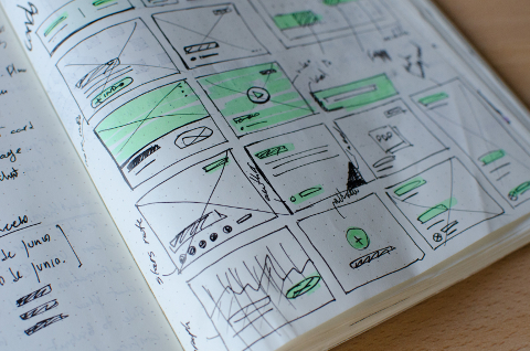
User interface is the heart of interaction; it enables the user to access the website easily and efficiently. When a user visits a website that is easy to navigate, the more likely they are to warm to the product, and potentially complete a purchase. User interface ensures the user experience is as good as it can be. UI allows concepts such as visual design and interaction design to come together.
The key to user interface is to keep it consistent, as the user will become familiar with how your website works. Without this consistency, your site could potentially become complicated and inefficient to the user.
There are many interface elements to consider, many of which are hidden out of sight, and allow the user to navigate easily through a website. One element we can focus on is the navigational components, which consist of sliders, tags and icons. A navigational component divides content up between pages, and allow the user to skip between pages.

You can also consider the input controls, consisting of buttons, check boxes, drop-down lists and toggles. An input control will allow the user to perform a variety of functions within the website – for example, selecting items and uploading files. There are also informational components, including icons, notifications and message boxes. An informational element is essentially a link. It can record copyrights and license information, plus many other factors.
There are a variety of ways to make the most of user interfaces, ranging from consistency of pages to colour and texture. We have seen from many years of experience in website design, that keeping the interface simple is the best way. It is vital not to add unnecessary elements, and ensure it is very clear to read. If you ask any web designer, they will say the best interfaces are almost invisible.
With this in mind, consistency and practicality are very important when constructing your user interfaces. Using common user interfaces will allow your user to become more familiar with them, making it easier to navigate their way through the website. Consistency of language, design and overall structure will make the visit to the site more enjoyable for the user. If you were to visit a website and soon discovered how to navigate your way round part of the website, you would find it very annoying if the other half had different user interfaces.
Colour and texture can be used to attract and maintain website use. By using different colours and textures, you can subconsciously direct your users to different parts of the page. This will link with typography and how you use your resources effectively. Choice of font, size of font and layout of text (typography) features in this equation. Always make sure that your text is easy to read by using appropriate colours and fonts.
It is essential that your system always informs the user of what is happening if a potential update coming up or maybe an error has occurred. By ensuring that your user is up to date at all times with the current status of the website will massively reduce frustration and confusion for your user.
Call to Action
A call to action is a vital piece of the puzzle – in an ideal world, you need a response that users can complete. But how do you encourage this to happen? What are the most effective ways to create a strong call to action?
The majority of websites will have some kind of a call to action – from signing up to a weekly/monthly newsletters, to completing a form with a view to contacting the company. This process seems simple, however, to get the user to complete a call to action is more difficult than you think.
A call to action will make it clear to the user what action to take next, and where it will take you within the website. This may mean staying on the website for longer, resulting in a higher chance of purchase, or simply understanding your product more. They could even tell others and share the product or service.
If we look at many websites, they will post weekly or monthly blogs or newsletters. At the bottom of the page, there is usually a call to action, most commonly a ‘sign up’ or ‘contact us’ button, which is a simple way to increase the involvement the user can have. There are numerous ways you can use this function; you can get the user to sign up to receive a newsletter by email, or to be notified when it goes live, or potentially a member-only newsletter.
A contact us button may spark a question in the user’s mind, possibly resulting in them emailing or calling the number. All these put together without the user consciously realising is drawing them further in, by simply placing these calls to action where fits necessary. The interaction cements a relationship with the user, and is important to increase traffic and functionality within the site.
There are numerous further examples of a call to action below:
- Sign up (newsletter, membership)
- Free trial
- Contact us (customer service team)
- Discover more
- Find us
- Social media (Facebook, Twitter, Instagram)
- Buy now
- Add to basket
UX (User eXperience)
The marketing industry has constructed many ways to improve your user experience – from optimising page speed, to simple consistency – all these factors put together will guarantee to improve the user experience, potentially resulting in your call to action to be addressed (further information below).
In order to get the best user experience, it is important to understand your users, their abilities and limitations. Improving the user experience gives you the best chance of a good relationship with the customer, with their interaction with the product, and any other services you may provide.
There are many factors that make for the best user experience:
Useful: Is the experience you’re providing useful to your user? For instance, is your website informative, does it provide a solution to problems your user may have?
Usable: how easy will the user find it? The aim of the game is efficiency and swiftness.
Desirable: how aesthetically pleasing is the brand, logo, images used to sell the product and explanation of its function? If the product you’re selling is shown to be desirable, the users won’t be able to resist.
Findable: how high does your website rank within the world wide web? Is it easy to find and does it attract a lot of traffic? These factors are vital in effectively advertising your product. Is there a certain area of the website simple to find and to navigate to?
Accessible: can your website be accessed and used by people with disabilities? If one of your users is deaf, then the option to listen to the content should be available. Not only will this make your website more accessible and ethical, but it will also increase your traffic.
Credible: does the user believe everything you say? The internet is so vast, and there is so much information out there, trust is a valuable asset in a customer in retaining good relationships.
Valuable: if a website includes all of the above, it will ensure the user’s time is spent wisely. Time is money – the easier it is for a user to find the product, the more they will spend. Ensuring your users’ time is spent wisely will also ensure you get the best out of your own time.
These are demonstrated in further detail in Peter Moville’s User Experience Honeycomb.
How do I create an effective call to action for my website? There are many ways to go about designing your call to action and simply thinking of what words to use. A call to action needs to have a meaning, a value: there is no point adding a call to action that will not benefit the user.
Always ensure that the call to action will link with the product or service you’re selling, and ensure the user will want to proceed with discovering your website. If you have offered the user a sign-up option to your newsletter, ensure that it will be informative, and link to your website.
A good design is also key in designing your call to action: you want it to grab the user’s attention. Choosing a bright colour that contrasts with the page is an effective way of doing this. Again, think about typography – font size is a way to attract the user.
You will see many calls to action will be short. You want your user to read it quickly and respond equally swiftly. Again, time is money – long sentences mean more time spent reading, and possible distraction – it is vital to make the most of the time you have with the user, to get the best from what they will do next.
The Goal

It’s easy to have goals, but how do you achieve them? You may have just started up or are currently running a business that can be busy from time to time but just not consistent enough. You may have a website, but it needs to be the best tool for you to interact with your customer. This is where having a high-quality user experience will boost business and increase your website traffic. We hope we have given you a brief overview of how you can get one step closer to the perfect website. There are many goals to strive for, and these are a few examples of the most common.
We hope you have now got a strong idea of the key aspects of developing and managing a website to the highest ability.
