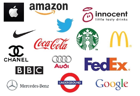
As a mean of individualization and identification, a logo has a number of predetermined requirements. The variety of demands to the logo comes from the fact that the conditions, in which operate countless participants of the market, are also significantly varied. Therefore, you have to take into account different sectoral characteristics, the nature of competition, product type, positioning, and many other.
However, among the variety of the requirements for a relevant logo, there are a few basic ones, compliance with which is a must, regardless of the specifics of the business.
Identity
The brand’s identity is crucial for promoting your business in the very competitive market. Since you have to stand out from many other market players, be sure to use original elements, styles and combination when designing a logo. This requirement is fundamental: it will allow you to register the trademark and use it use without violating the rights of other companies.

Simplicity
To be fair, this requirement is advisory in nature. But note that simple logos, which can be designed in Paint, are much easier to remember and associate with the brand. Simplicity means the use of the logo elements that can be easily identified by the target segment of consumers. You can achieve simplicity by focusing on the model of the average consumer and restricting the number of elements in the logo.
Attractiveness
This is the ability of the logo to evoke positive emotions and associations with the business. Since this is one of the most difficult to achieve requirement, the minimum objective for you is to use graphic elements that do not cause negative emotions.
In the most common sense, such a logo easily attracts the consumer’s attention to the designated features of the brand and creates a strong connection between the customer and the brand. It is characterized by the following combination of features:
- The novelty of ideas.
- Aesthetics.
- Conciseness.
- Adaptability.
- Associativity.
- Pronounceability.
- Manufacturability.
Recognizability
Your logo has to be easily remembered and identified by both target segment of consumers and all those who see the logo for the first time. To ensure this quality, be sure to add some expressive and associative elements.

Patentability
As we said above, when creating a brand, you have to register it. Of course, the logo must be unique to be registered as required by law. Patentability also implies the ability of the logo to this status throughout the registration period.
Another important requirement should be taken into account is the associativity. Associativity is the presence of relations and association between the logo and the characteristics of the product.
All these requirements are closely interrelated. Identity, simplicity and attractiveness of the logo are the key to its recognition. Individuality and recognition of the logo contribute to its patentability; identity ensures brand’s recognition at the stage of registration of the mark while recognition helps to maintain patentability later, even if the mark has acquired great fame.
Also, there are some specific requirements for the logo used on the international market:
- Adequacy of the content.
- Compliance with the objectives and the image of the brand.
- Ability to be used in different forms: in print advertising, in business documents, in television and cinema advertising, ability to be printed on the fabric, scalability.
- Regional nature: accounting culture, religion and other peculiarities of the particular culture.
In everyday life, we are constantly faced with a variety of logos of various companies. Some are quickly forgotten or simply invisible; others are deposited in our memory thanks to successful or unsuccessful chips or due to associations. Visit https://www.designcontest.com/ to see the logos that fit all of the requirements above and start your own design contest.
Creation of the successful logo quires knowledge and experience from different areas of expertise – from design to psychology– therefore, the high-quality logo just can’t be a product of a novice. When designing a logo, you have to consider where the consumer often will see it: on the company’s letterhead, on the product packaging, printing, video advertising, outdoor advertising, etc. If the logo is supposed to be small, then make sure the small visual elements do not become a gray spot (also, the use of ornamental or serif fonts makes the text illegible).
Consequently, the logo shape should be streamlined, simple, without too small and sophisticated elements. And, of course, fit all the requirements we considered in the paper.
